
When One Isn’t Enough Apply The Creative Principle Of Addition
Copywriting ideas build on themselves when the principle of addition is applied. Content created with this concept could greatly impact the effectiveness of your website, marketing collateral, and visual materials.
The following six print ads use the creative principle of addition. The first three use a method of “plus one” and the second three use a method of “duplication” to formulate their message.
Plus One
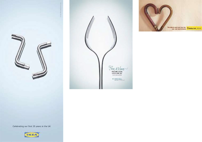
The three ads below applied the same creative strategy in different ways. IKEA positioned two identical Allen wrenches to form the number 25 in celebration of their 25th anniversary. The print ad for Sea & Vines Food and Wine Festival represented the notion of food with a fork and signified wine by adding a second fork in parallel to outline the shape of a glass. Nonprofit Helpage India visually communicated their message that the elderly need love too by positioning two walking canes in the shape of a heart.
The creative principle of addition works well in these three ads because the objects used in each are symbolically connected to the message or advertiser. For example, Allen wrenches are associate with IKEA because they are used to assemble their products. Forks relate to eating and glasses with drinking. The presence of both walking canes and the aged are not only a natural combination but an expected pairing.
Each ad was also effective because of its uncommon frame of reference. The conversion of complete items into parts of a whole new object alters expectations. An Allen wrench changes from a tool to a number; two metal forks form one crystal object; and the meaning of a walking aid transforms into love.
Duplication
The use of addition in the prior set of print ads reduced the value of each object by half, making two of the same objects necessary to create a new whole. In the ads below, the use of the creative principle amplifies each ad’s message.
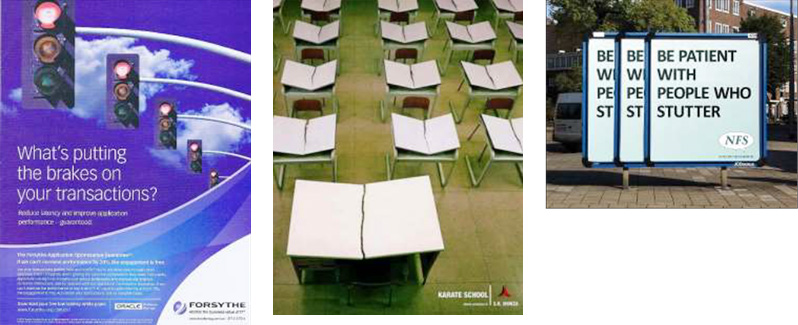
The point of the FORSYTHE print ad is made by adding one stoplight after the next. SR Monza Karate School uses a volume of images associated with martial arts and education. NFS visually demonstrates the definition of an auditory problem with the redundancy of the same ad.
Each of the ads could have communicated their message with one visual, however, adding repetitive imagery made them more poignant and memorable.
Commonalities Amongst Differences
The creative principle of addition can be executed in multiple ways –two of which have been exemplified above. While each followed a different method, both approaches were implemented against a shared set of tenets.
- The creative principle of addition is a visual application. This holds true even when no image accompanies the headline. In this case, each word, or letter in the word is treated as a visual element to convey a message with its formation, positioning, etc.
- Ads that apply the principle of addition use copy to reinforce or complement what is visually conveyed. The headline is not meant to shoulder the ad’s impact.
- Print layouts have a minimal number of elements and their message is overt, obvious, and simple.
Consider the principle of addition at the start of your next project, or as a means of getting unstuck.