

What You See Is Not What You Get
What do dk, VOGUE, MOTT’s, and ASHLAND sell? Based on the print ad headlines below, it’s hard to tell. THIS IS NOT A CHAIR …, This isn’t an empty box …, It’s Not A Roof …
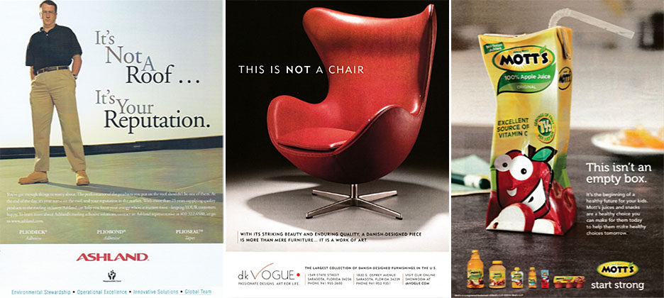
The contradictory mismatch between the print ad’s headline and image seems confusing at first but becomes clear after reading the copy. Each print ad uses a creative technique of inequality in pursuit of establishing differentiation and value. This approach is especially common when selling in highly competitive or commoditized industries. The objective is to change the way a buyer thinks of a product so that it is perceived as unlike and better than available alternatives.
THE BENEFITS OF INEQUALITY
Most purchasing behaviors driven by emotions are justified by logic. Customers that feel guilty about their choice (e.g. indulgence over prudence), or second guess their decision, often quell their internal consternation through rationalization. The copy in these ads provides an explanation customers could give themselves or others to legitimize their selection.
Dk Vogue, for example, sells artistic masterpieces for display on a floor – not furniture. The functional utility this chair offers is an added value – not a criterion of evaluation. Mott’s sells apple juice PLUS a positive influence for a strong future. Each finished container is tangible evidence of a child’s nutritious diet. An empty Mott’s juice box is a pleasant reminder to parents that they are helping their children establish healthy habits while they are still young.
The inequality technique is as effective for products used by end users as it is for those who represent them. The last ad by ASHLAND reminds resellers that they aren’t just selling a roof, but their reputation. The print ad suggests that companies become more profitable when concentrating on acquiring new customers, not problematic callbacks, by using ASHLAND.
SIMILARITIES AMONGST DIFFERENCES
The products we buy and the services we sell are rarely equivalent to what they physically are. On the surface a chair is nothing more than a seat typically with a back and four legs; apple juice is a liquidized fruit drink, and a roof is a top cover to a home or building. When thought of using these actual terms, anything that meets these criteria is considered the same. The difference between a website, brochure, or direct mail piece that tells and sells, is the distinction between what we look at and what we see. The role of marketing is to tell the rest of the story, make intangible strengths concrete, and change the way a product is perceived.
Each sample ad above conveys the same notion in different ways – “it is not what it looks like.” This creative construct is used to attract attention and give potential customers reason to pause and ask themselves “what is it then”? The conflicting association between the ad’s words and visuals invites viewers to look below the surface and see the product’s greatest benefits.
For optimal results, don’t sell what customers look at – help them buy what they see in their hearts and in their mind’s eye. The “not equal to” technique not only creates instantaneous contrast through inconsistency but sets a platform for explanation to a captive and curious audience.