
Google Rewards Mobile Websites With Higher Rankings
You may have heard, read or experienced first-hand that Google is rewarding mobile-friendly websites. Websites that are mobile compliant across PCs, Mobile Phones and Tablets are being rewarded with higher rankings. This positive incentive is further encouraged by Google’s penalties against websites that make it difficult for users to navigate. Considering nearly 70% of searches begin on Google, the likelihood of your potential customers using this leading search engine to find what you and your competitors offer is very high. It’s in the best interest of your business to learn how to benefit from Google’s tough love and capitalize on this current opportunity.

Google has already started incorporating mobile criteria into its SEO algorithms and the effects are noticeable. Every business found through Google will either love or loath this new reality.
While creating a mobile website does require an investment, it is far less than the cost of lost sales opportunities or investing in strategies to recover from negative first-impressions. The investment required to develop a compliant mobile-friendly site will be mitigated by 1. Being seen by more potential customers, (compliments of Google) 2. Welcoming visitors instead of deflecting them in frustration and 3. Higher conversion rates because interested visitors can easily navigate your site and call you simultaneously.
So if you’re investing time, resources or dollars trying to elevate your website’s visibility, maximize your return by making your website mobile-friendly first.
When you’re ready to cater to mobile users, you should:
- Have a new site optimized for computer and handheld devices, or
- Have your existing site transformed into a mobile-ready version.
There are strengths and limitations to each alternative, but the end goal is to create a positive user experience for your visitors and make your website user friendly across all platforms.
If you already have a mobile website, use this checklist for optimize its performance and conversion potential.
- Tailored Content. Consider the most important content visitors might need when accessing your site by mobile device instead of simply removing content from your desktop version.
- Same Domains. Domains have brand identity and impact search rankings so it’s important to maintain one domain for all devices.
- Pop-ups. Avoid pop-ups on your mobile website, they generally lead to a bad user experience.
- Playable Videos. Use HTML5 standard tags to include videos and avoid content in other formats, such as Flash, that are not supported by all mobile devices. Consider having video transcripts available on all devices – it may better serve your smartphone users.
- Proper Redirects. Make sure to configure the redirection so that users end up on the correct destination page. Common errors include redirecting a user trying to access a URL on the desktop site to an irrelevant URL on the smartphone site. Or redirecting some mobile devices but not others (e.g. a site may redirect only Android users to the mobile site and not redirect iPhone or Windows Phone users).
- Quick Loads. Sites that load quickly generally offer a better user experience. On mobile, users seem even more sensitive to speed and more likely to give up if the website doesn’t load fast. Pages should render in under one second. Use Google Page Speed Insights to analyze page loading issues for your site.
Don’t count on Google having a change of heart. Varying sources consistently state that by 2014, 50% of search will be done by mobile device…and we are quickly closing in on that estimate now. Traffic from Tablet and Smartphone users has nearly doubled in the last year, according to SmartInsights.com. As mobile continues to grow in usage, the tough love Google has instituted will make things even more difficult on older, non-mobile, websites.
Considering Google owns Android, (the number one mobile operating system), Google’s sites rank as the top web property on smartphones, reaching 92.2 percent of the mobile media audience (mobile browsing and app usage),1 and the better the user’s experience across ALL screens the more money Google could make selling ads…it’s easy to understand why Google wants website owners to “fix” their websites.
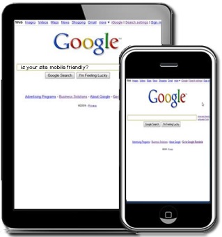
If you’re still wondering what to do with your site, try accessing it from your mobile device. If the site looks exactly the same on your cell phone as it does on your PC, chances are you’re frustrating potential mobile customers and missing out on Google’s rewards by not tailoring your website to behave more mobile-friendly.
1 Source: comScore Mobile Metrix